
HoloJamo: Augmented Reality Browser & Navigation
Company
Client
Date & Length
Role
Tools
Framework
Maps + Pokemon Go + Web Browsing = HoloJamo.
Imagine a world where digital information is more accessible then the current web. A world where useful digital information lives right on top park monuments, store products–anywhere you can think of, indoor and outdoor–and that information is universal accessible on any phone. This is the problem that we sought out to solve, and in response, we created HaloJamo, a first of it's kind visual browser for viewing location specific information in the form of augmented reality experiences.
This browser is built on top of WorldRegistry, our CMS for placing holograms in stores and places.
Discovery
Iteration 1: Using Lean UX To build our MVP
Assumptions Survey
The survey was taken by our Stakeholders and included client needs, how they can be solved, who's the user, most important features, etc.

Affinity Mapping
I mapped out the survey data (using Mural.ly) into a tertiary pattern of business assumptions.

I then took that data remapped it into our business assumptions.
Hypothesis to Requirements
With Our assumptions defined, I created our Hypothesis statements about WorldBrowser.


Getting "Out The House"
Our Assumptions were then tested at the Guggenheim. We picked the Guggenheim because the Guggenhiem app has a similar feature, the "what's around me," feature which uses beacons to give location based information about paintings.
After talking to several app users at the Guggenheim who use the "what's around me" feature, and the help desk which give out iPods that have the app, we proved 2 of our assumptions and disproved 1.
Sketching & LoFi Wires
AR Location States & Icons
These are the representations of the User, and AR Locations on the 2D Map. From left to right you can see Empty, On, & Off states which are represented with different colored icons.
AR Location Cards
These cards allow a User to enter into AR Mode if they click on a AR Location that is active (meaning they are close enough to interact with the Location IRL).
AR Mode: Content Cards
AR Content Cards are the key component for taking digital actions in the real world. Theres 2 types Content Cards, Single Action and Multiple action cards. Multiple Action cards open up to a separate page with the list of available Action List links. The Links are then handed off to an app or browser.

Iteration 2: Updating the Experience
For our latest update, we used feedback from Bloomingdales customers and created a new persona: Cassie, AR Enthusiast.
.png)
Knowing Cassie's needs, we created a story map of what we needed to build to give her the best experience.
Story Mapping
Working with the Bloomingdales team, our developers, and our biz dev stakeholders, I lead a workshop using narrative story mapping to create our design requirements. The work was done remotely, so we used Murally to facilitate the workshop.

The story went as a so:
1. Cassies at the mall because she needs sportswear. She sees the Bloomingdales she's near has AR Experiences.
2. Cassie taps the Bloomingdales for more information.
3. Cassie Sees that theres holograms all over Bloomingdales, and all different, some of which have actions (URLS).
4. Cassie goes into AR Mode for Bloomingdales.
5. Cassie sees a UFO hologram and is amazed!
6. Cassie sees she can get directions inside Bloomingdales, and gets directed to the Woman's Sportswear.
7. Cassie is directed with AR arrows to the spot. When she's there she sees a dancing alien hologram.
8. Cassie takes a video of the alien and shares it to IG, Twitter, etc.
9. Cassie taps the alien, and gets a 50% off coupon. She buys her sportswear and tells all her friends about the experience.
With our story and requirements identified, we mapped out what sprint each requirement belonged to, and then placed them into Trello.
Note: The following files are all for Iteration 2 of WorldBrowser called Holojamo
Ideation
Flowcharts

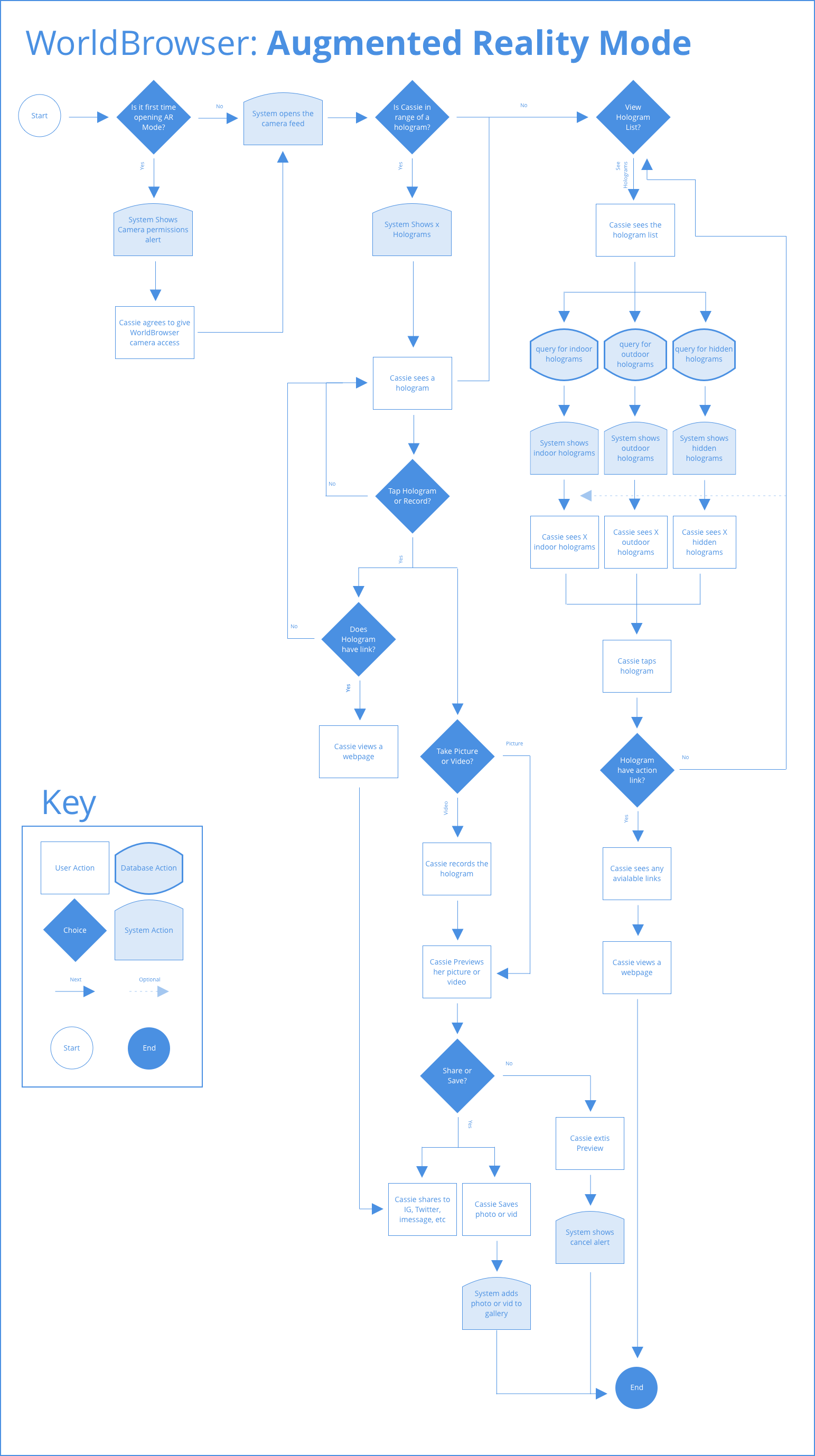
Map Mode: See Whats around you
Users can see what Places around them have AR experiences. If they're in range, the AR Button and place pin become active, signifying they can go into AR Mode. If they aren't in range of an AR experience, they can still tap the AR button to see the closest place, or enter AR mode anyway.
When they tap the AR button, the system opens the Place Card modal for the closes Place to them. This card lets our user enter AR Mode.

Right: AR In Range
Place Cards
The user can see how many holograms are at place, the address, and some context about that place, whether they are in range or not.

Right: In Range
Hologram Lists and Associated Actions
Users can see all the holograms available and filter by hologram type. They can see a larger thumbnail of the hologram anchor (anchor: the point or object where the hologram is attached to) and access any attached URLs.

Right: Anchor Details
Viewing Holograms and Indoor Navigation
Once they're in AR Mode, the user can see and interact with the holograms provided by at the Place. They can also take a picture or video, sharable to their social networks. The user can also get directions to different points in the store using AR.

Right: AR Mode Directions, Step 1
Prototyping
We then created a simple prototype using sketch cloud for testing the flows (note: this prototype's has the updated visual design from the Palo Alto tests).

Testing
Testing Prototype in Palo Alto
Prior to our testing, the UI was very simple.


We did a study with 6 high school student in Palo Alto and found that although they liked the concept of the app, it didn't speak to them visually. There biggest concern was the visual design. They called the colors, Typeface, and patterns "industrial" and too business-focused. They also hated the name WorldBrowser. The dry design also impacted how they perceived it's usability. The general consensus was that it looked hard to use
Introducing: HoloJamo
Punny Typeface, Background Blur, and Gen-Z Yellow
We wanted typeface thats versatile, has readable weights, is bold, beautiful, and fun. So we went with the google font Poppins as the primary font and Open Sans as the Secondary. We then researched the most liked color by Gen-Z highschoolers and found its this vibrant yellow color. Then to add a coolness factor, we added background blur at 5px to all cards and overlays.


Making Holograms Easier to Find
Although the UI and flows made sense to the kids, there was some technical pain points in how we delivering the hologram content. One of the major challenges user testing showed was that it's very hard for users to find our computer vision anchors. This is because they are markerless. An anchor can be any object or point in a store, so there is no signifier like a QR/barcode code. In order for the hologram to be triggered, the user has to point their phone at it using their camera. In short: the user has to find a hologram experience, rather be provided one.
While this works well for some use cases, users expect the experience to be present without any work. To improve their experience, we added 2 new channels:
- GPS for outdoor holograms.
- IndoorAtlas, a tool for indoor holograms and navigation.
The UI Challenge
The GPS, IndoorAtlas, Computer Vision-based Hologram experiences all function the same at the user level: they allow a user to view a hologram, and they allow the user to view any attached data to a hologram (a URL to a webpage, video, image, etc). But, due to technological constraints, we need to show them very differently.
My challenge was to make a simple, unified experience, providing a birds-eye view of all the holograms at a place, and what data they carried (if any).
The Solve: Inside, Outside, & Hidden Holograms
The user doesn't need to know which technology is behind their experience. They just need to know where holograms are. I started by thinking of the architecture based on where they will interact with the Holograms. I came up with 3 types: indoor, outdoor, and hidden holograms.
If a users looking for inside holograms are shown on the provided floor plan. Outside holograms are shown on google maps. Hidden Holograms can be placed and trigged anywhere, so they are represented with a thumbnail.

The outdoor and indoor holograms maps show an active hologram range of 100 meters to improve whats called collusion meshing (basically it's how 3d objects look in the physical environment), Anything out of range is shown with a grey icon. This takes the convention of in/out of range pins from the main map to make an understandable experience for our user.
A user can see if a hologram has any data by tapping on an icon, as shown to the left. If there is no action available, the popover just shows the hologram name. I made this tap 1 & 2 interaction the convention for viewing holograms with data across channels. To give prominence to holograms with URLS, I added a shadow to those icons/thumbnails.
For addtional context, we show the total # of Holograms in the modal title, and holograms per type in the tabs. I used a half-screen modal to make a better experience in AR mode. If the view was full screen in AR mode, the user would have what's called broken presence. When they reenter, all holograms would have to reload.The half modal reduces the negative impact of the technical contstraints and create a more cohesive experience.

Right: AR Mode – Indoor Hologram, No Action
Final Product
Results
Unfortunately, the pilot fell through. But, the company has received interest from major entertainment and sports corporation such as the Oakland Raiders for the indoor navigation capabilities.
Most recently, HoloJamo was the US 2019 AWE (Augmented Reality's Biggest Conference) app for indoor navigation.
The product was then rebranded as HoloGrid and is available on the AppStore.
View on Appstore
